


Product Analytics 101 for PMs at B2B startups
Diving into four metrics & reports I use in my day-to-day work to derive actionable product ideas

Question for today: Do you use user behavior data to guide your decision-making?
9 out of 10 self-respecting PMs I speak with will tell me “Of course I do!”
But do you really though…?
Here are the most common problems I see:
We spend a lot of time staring at data that isn’t actionable. Revenue has dipped. So what?
We’re looking at all the reports we’re supposed to (user activation, retention) but don’t know how to interpret the data. Is this good, or bad? What action should we take next?
In this 4-part series, I’ll outline four common metrics or charts I use in my day-to-day work, and how I derive actionable insights from them. I’ll also give you a little peek into the product analytics tech stack I use for B2B startups.
User or account-level activation
Detailed onboarding funnels
User or account-level retention
Feature adoption and retention
Part 1: Activation
Defining activation: sign up, set up, aha, and habit.
Product analytics is all about defining and redefining what the different terms mean in the context of your product and target audience.
To make things complicated right out of the gate: Most companies work with two separate definitions for ‘active user’ and ‘activation’ in the product sense. They tend to count anyone who logged into the app or triggered any event in a certain interval as an active user. Pretty broad.
Activation in the product sense however is more restrictive. It should be a leading indicator for retention. You’re looking for an action or event that shows the user is somehow getting value out of the product. Logging in and subsequently doing nothing likely doesn’t mean that they enjoyed their experience. Rage-clicks might trigger events but they don’t mean that your user is likely to come back.
Reforge breaks down activation into multiple pieces, putting ‘aha’ at the center. Here’s an example:

Signup & setup tend to be relatively easy to define as they represent linear steps. All new users must submit some kind of sign-up form and then take the necessary steps to set up their account, workspace, project, etc., which enables them to start using the product.
Things get tricky at Aha. What action indicates that a user has experienced the core value of your product for the first time? Do you even know what core value they are looking for? This gets more complex when you cater to multiple divergent use cases, serve varying roles within a team, or are targeting multiple ICPs. Check out this older article of mine for a deep dive.
‘Habit’ is even harder, because it doesn’t happen in the shape of a funnel, but a loop. Users need to experience recurring, or even expansive value on a continuous basis.
And a tough one at that. It requires:
🔷 𝗥𝗲𝗰𝘂𝗿𝗿𝗶𝗻𝗴 or even expansive 𝘃𝗮𝗹𝘂𝗲. It's nice that a user realized the value of your product for the first time, but can you keep delivering enough value to keep them coming back? Whereas the first moment of value realization can be quite focused (maybe 1, max. 3 Aha moments for different user categories), what 𝘳𝘦𝘤𝘶𝘳𝘳𝘪𝘯𝘨 𝘷𝘢𝘭𝘶𝘦 looks like will differentiate exponentially per user. We're not looking at 1 moment in time, but hundreds, trying to detect patterns.
The image attached shows an example for a B2B SaaS product analytics tool (a Mixpanel/ Amplitude competitor). Value prop: Easily build & share out-of-the-box reports, run search queries in natural language. You see how the funnel toward Aha is still pretty straightforward. However, the habit stage takes the form of an ever-expanding loop, which can look slightly different for each user. Detecting & optimizing patterns in this mess is the real challenge.

In short: Defining what the terms ‘sign up’, ‘set up’ ‘aha’, and ‘habit’ mean is the hard part, and getting it right is a continuous effort. You’ll start with a rudimentary proxy for aha - the best thing you can come up with with the limited data and knowledge you have at your disposal, and keep refining it as you learn more.
Pragmatic tip: If Habit is too complex to define, just leave it out of your activation report for now and focus on the steps you can confidently define. I’d rather leave a step out entirely, than define it incorrectly and create a false impression with data.
“But we don’t have enough data”
In B2B startups we often operate with limited quantitative data. We haven’t been around that long, we might have fewer than 500 customers. That’s okay because we can supplement it with qualitative data. Talk to your users to find out what jobs they’re trying to get done with your product, and what value means to them. Shadow new users (or non-users who fit your ICP) as they use your product for the first time. Watch session replays, for example with Hotjar.
What are your users trying to achieve, and what’s blocking them?
Getting actionable insights out of activation charts
Most modern product analytics tools, like June (my favorite for B2B SaaS) come with out-of-the-box activation reports. You’ll need to adjust the steps in the report to reflect the definitions of the terms you’re working with.
Here’s an example:
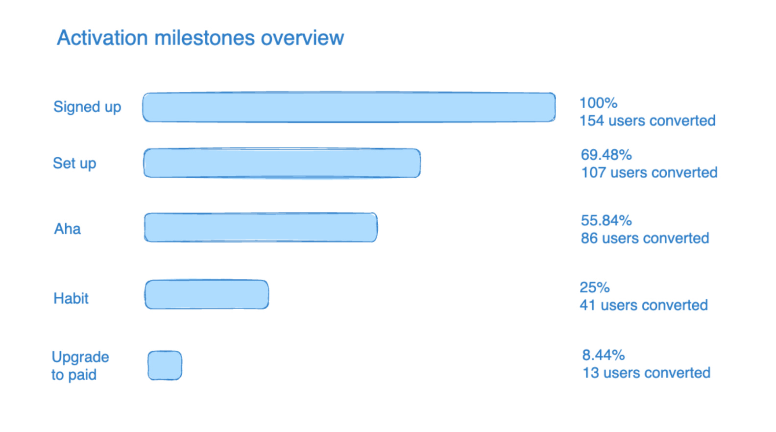
You might notice that I sneakily added the step “upgrade to paid”, which isn’t part of the activation metric. But since getting free users to upgrade to a paid account is imperative for the PLG companies I usually work with, I factor it in. Firstly, upgrading to paid is a powerful signal (though not the only one) that a user or company is getting value. Secondly, turning free users into paying user, is what makes the business run. Of course, you’ll have 0% of users upgrading to paid if I’m looking at a 7-day cohort for a product with a 14-day free trial.
So how do I get actionable insights out of this?
Common sense
Let’s look at a different activation report:

It’s immediately obvious that we have a huge drop-off between setup and aha. Users are not seeing the value of our product quickly enough - this is the number 1 thing to address. Perhaps a short onboarding survey, to figure out the first thing a new user is trying to achieve, plus a personalized onboarding flow will help.
Industry benchmarks
Especially useful when we don’t have any crazy - obviously problematic- drop-offs like in the previous report. I compare to industry benchmarks.
I like to use the benchmarks from Lenny Rachitsky’s newsletters, for example these for activation:activation rate = [users who hit your activation milestone] / [users who completed your signup flow].
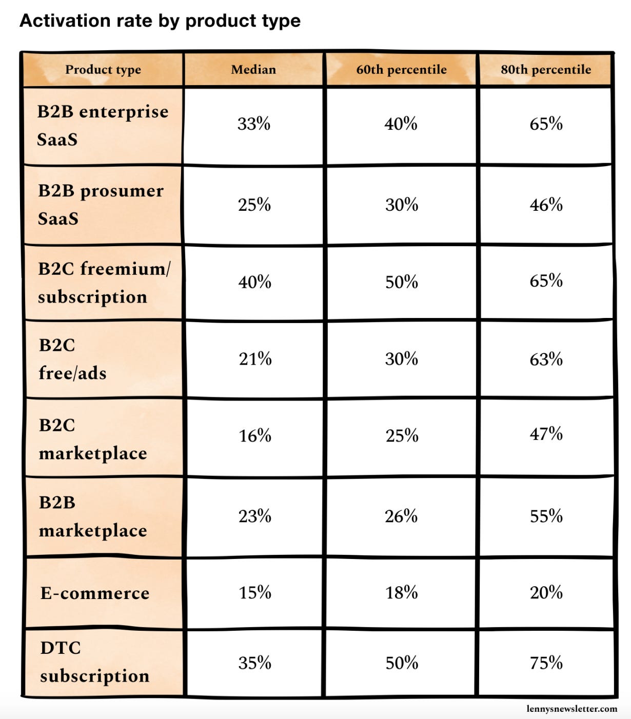
Or these, for a benchmark for a free-to-paid ratio:Free-to-paid conversion = [new accounts who begin paying within their first 6 months] / [total new accounts created during the measurement window]

Example activation report for a B2B prosumer SaaS:

Our 25% of users reaching habit fits the industry median, and our free-to-paid conversion is at the lower end at 8%. We might want to dig into why not more companies are converting to paid, for example by doing user interviews, popping up 1 question surveys in the app or sending super short exit surveys via email.
Historic data
I compare to our own historic data. Once we start measuring and trying to improve our activation metrics, we can look at how they develop over time.
June lets you set up a Slack connection that automatically pushes your activation report to a dedicated Slack channel every week. I also make a point of talking about how we are doing on our activation metrics continuously.
Account-level activation
So far I focused only on user-level analytics. For B2B companies it’s imperative to also look at account-level analytics. We need entire teams to be successful, if we want to upgrade a free account to paid. We need to identify which companies fit our ICP and who the economic buyers are to know where a product-led sales effort might make sense. We need to understand which existing companies we might be able to upsell or expand.
June offers both user and account-level analytics out of the box.